
Monday, October 12, 2015
Pattern

Motif

Tuesday, September 8, 2015
2 Things That Go Together

2 Things That Go Together
Two things that I had seen that were similar were a dialog clock and a digital clock. Both of them show time, but in different ways. I had thought of the idea because whenever we are in school all we do is look at the time to see when school ends. I had also created the time from the date of my best friends birthday.
Friday, September 4, 2015
Pencil Project
Pencil Project
Part 1:
The beginning of making the pencil had taken multiple steps, but it turned out pretty good. The pencil was really fun to create because it was cool to see that multiple shapes and turns made the pencil come to life. The cup was harder to make because I couldn't figure out how it was being made.
Part 2:
The second part of creating your own pencil was a lot more easier. I had already made the pencil and the cup so this time of making them again. It was difficult trying to find out what colors went together and the page was a figure of the main idea being in the center of it all.
Part 3:
The last part of designing something with the pencil was awesome because I had thought of the idea of buildings. The idea was to make the pencil and the cup become buildings in a city. I then added some clouds and a sun for the page to make it look like a city.


Sunday, August 23, 2015
What is Graphic Design?
What is Graphic Design?

Graphic Design shows what your mind is thinking once you put it down on paper. The concepts to being a Graphic Designer is to bring out the creativity and inspiration that you keep inside and be able to draw it out on paper. We have the ability to show who we are artistically and make something look beautiful. With using words and images we can be interested in human behavior. The best part about graphic design is that we can create moments that everyone will remember.

Friday, August 21, 2015
3 Sites, Then and Now

 Apple Then and Now
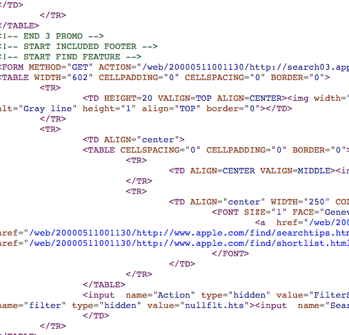
With the newer Apple website, you can see that the Apple logo has changed from the red color to the white logo color. The design of the website went for a more close together of all the tab to a wider tab space. With the newer upcoming of products, the newer website has made tabs to put the products in their own specific tab. The HTML with the newer website is shown to use less wording and shortcuts. The older website HTML has used lost of writing and shortcuts.


Spotify Then and Now
 The layout of the newer version of Spotify has really taken away the tabs that the older version of Spotify have on the website. The colors have become more dim with the green. The fonts on the newer version have been a more modern, regular font and the older version have fonts that are more playful. When using the newer version the website designers had made it to just be able to click on the most important thing which is the download button. The less importance is towards the bottom.


The newer version of Skype has changed the color of the logo and site from an orange color to blue color. The fonts on the older version has changed from a bold text font to regular bold font. The newer website had put the download button as the main importance and the older website had put the explanation as the importance,


The purpose of the Wayback Machine is to show what things were like in the past life. They are trying to show how the websites had been brought up before we all started using it. They are showing the information that was most important back then.
Wednesday, May 20, 2015
End of The Year-Final Project
Final e9 Project
Woof Inc. Commercial
Our video rotation was a fun experience. When we had thought of the product we were wanting to do, we knew that our commercial would need a dog, dog owner, and some sentimental view in the video. After thinking of the perfect idea, we had found the perfect dog and destination and made the Woof Inc. Commercial.


Woof Inc. Packaging and Collar

 Woof Inc. Website
In animation, we were given specific jobs to come up with a 3-D animation of our product and packaging. We had all made our product using Google Sketch-Up to create the dog collar. We wanted to have the collar included with the speaker and buttons that can turn on the language controller and change the language. After that, my job was to create the packaging using Sketch Up and our team was wanting to have a package that would fit the entire collar inside. We had provided the packaging with the different colors for the collar and the link to our website.

Woof Inc. Logo
In our last rotation of graphic design, we had to create our logo that would represent our product and company. My logo is to represent a dog toy that would appear to look like it was bouncing off the ground and have the name of our company on the side. The idea came from what are some of the toys we will sell in our store someday.

Our website idea was to have colors that are popping and represent our logo and banner. Our website have tabs that take you to coupons, locations, and information about us owners and how we came up with the idea of Woof Inc. The website also provide the product that we had created in the animation rotation and the commercial we made in the video rotation and also our logo and banner from graphic design rotation.
Subscribe to:
Posts (Atom)